This is independent educational commentary based on a public newsletter archive. Sargent Law Firm isn't presented as a client or sponsor. The image below is a limited archive preview used for commentary; complete issues remain with the original publisher.
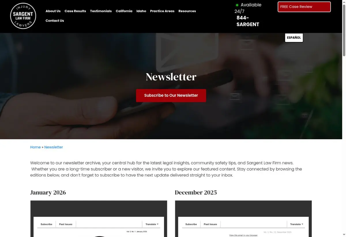
View Sargent Law Firm’s original archive →
The editorial idea in one sentence
A deep, downloadable archive makes the newsletter feel like an established publication rather than a temporary campaign.
1. Positioning: who is this publication for?
The print-style format creates a tangible sense of occasion. Multiple issues also make consistency visible: a prospective client can see that the firm has invested in the channel over time.
2. Content mix: why a reader would come back
The format has room for a lead story, shorter practical items, firm news, and a response path. That variety serves past clients who may not need legal education every month but still benefit from useful reminders.
The broader lesson is to assign every section a job. Some content should create immediate utility, some should demonstrate perspective, and some should deepen familiarity. When every section tries to sell, the newsletter stops feeling like a publication.
3. Design and reading experience
The visual opportunity is hierarchy. A strong cover, one unmistakable lead, short secondary modules, and repeated navigation cues help readers scan before deciding what deserves attention.
For email, the mobile preview is the real front page. The sender name, subject line, preheader, first heading, and first link should tell a coherent story before the reader reaches the rest of the issue.
4. Calls to action: what should happen next?
Use one primary relationship CTA per issue, read the lead story, save a checklist, or contact the firm, then keep phone and website details available without turning every module into a pitch.
A newsletter can support more than immediate consultations. Replies, forwards, downloads, event registrations, preference selections, and return visits all show that the relationship is becoming more useful.
5. What I would test next
Test a concise email-native table of contents against a PDF-first send. Track which stories earn clicks, whether mobile readers open the full issue, and whether a single featured CTA outperforms several equal-weight links.
Change one meaningful variable at a time and judge it by the action the issue was designed to create. Don't declare a winner from open rate alone.
Practical takeaways for another firm
- Treat the archive as proof of consistency.
- Design for a five-second scan before a ten-minute read.
- Give each issue one clear editorial center.
- Use the email body to preview value, not merely announce a PDF.
A deeper scorecard
Audience clarity
Can the right reader identify themselves immediately?
Editorial promise
Is there a repeatable reason to subscribe beyond firm announcements?
Content architecture
Does each section have a distinct role and visual priority?
Human voice
Could this newsletter plausibly come only from this firm?
Trust and restraint
Are tone, privacy, accuracy, and urgency appropriate to the audience?
Next step
Is the primary CTA useful, specific, and proportional?
Bottom line
Sargent Law Firm is worth studying because it makes a recognizable editorial choice. The goal isn't to copy the surface treatment. Borrow the strategic principle, adapt it to your firm’s audience and obligations, and test whether it creates a more useful long-term relationship.